Use app×
Join Bloom Tuition
One on One Online Tuition
JEE MAIN 2025 Foundation Course
NEET 2025 Foundation Course
CLASS 12 FOUNDATION COURSE
CLASS 10 FOUNDATION COURSE
CLASS 9 FOUNDATION COURSE
CLASS 8 FOUNDATION COURSE
0 votes
311 views
in Graphs and Charts for Business Data by (27.3k points)
closed by

Sales for the first six months in 2 years are given below. Draw a scatter chart in a LibreOffice Calc works sheet

Month 2015 2016
January 320 410
February 280 400
March 360 380
April 300 320
May 360 440
June 320 400

1 Answer

+1 vote
by (25.6k points)
selected by
 
Best answer

 Procedure: 

Step 1 – Open a blank worksheet in LibreOffice Calc. 

Step 2 – Enter the data in the following cells.
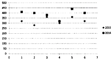
Month 2015 2016
January 320 410
February 280 400
March 360 380
April 300 320
May 360 440
June 320 400

Step 3 – Select the range A1: C7, which is to be shown in the chart 

Step 4 – Click on → Insert menu Click on → Chart → Chart Wizard → Scatter Chart→ Finish 

Output:

Welcome to Sarthaks eConnect: A unique platform where students can interact with teachers/experts/students to get solutions to their queries. Students (upto class 10+2) preparing for All Government Exams, CBSE Board Exam, ICSE Board Exam, State Board Exam, JEE (Mains+Advance) and NEET can ask questions from any subject and get quick answers by subject teachers/ experts/mentors/students.

...